Saturday 28 February 2009

Recognition Day - Shortlist

Here is the first from the designs that made it to my shortlist, which was derived from personal evaluation and crit feedback.

I wanted to create something that had very powerful imagery in hopes aid communicate better how powerful the act of forgiveness can be.
I also felt that some of the initial images were too cluttered and I decided to create something that was simple, yet effective.

This is what I came up with:The first image is one of the original photos that I took. The soap is used as a metaphor to convey that forgiveness can clean any hurt (stained hands). The washing of hands is symbolic of innocence in todays society and it could be credited to the story of Jesus' death where Pontius Pliate says washes his hands in front of the crowd and says, "I am innocent of this man's blood," .

I could have used an original photo on its own but I decided to edit it as I wanted to create a stark contrast between the white of the soap and the black of the stain, thus I increased the brightness/contrast and desaturated the image.

I used a scalpel to cut letters out of the soap and stained it with ink using a syring, which was a very messy job and crafting is far from one of my strongest points and the word 'forgive' was very illegible due to this. I liked the aesthetics but the message wasn't clear, so I decided to use photoshop to create the impression that it had been engraved professionly... but no matter what I did it ended up looking unconvicing.
Recognition Day - First Designs

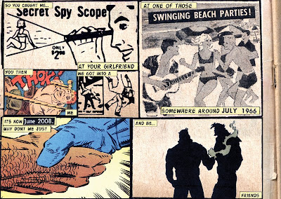
I thought that a lot of my designs had quite a serious tone of voice to them so I decided to create something that was a little more lighthearted, but still communicated the same message, this was the result:The problem with this design that its a bit too messy and hard to follow which is a pity as it was one of my favourite ideas. I only used imagery that was found scattered in comic books and put them into a story. I think if the design worked and it was possible to follow the story like you should, with the images speaking for themselves it would be quite strong, however it doesn't really achieve this.

Recognition Day - First Designs

Because I was struggling a lot with the first design I decided to develop an idea that would clearly communicate the message.

I decided to incorporate a quote from influental people that explains why forgiveness is so important. I also produced a version that incorporated the other side of the coin, 'saying sorry'.

This is what I developed:


After the crit, many said that there was a way too much text on the image and that because of the size it was difficult to read. The quote is one of the strong points of the design and to remove it, shorten it or make it larger would make the overall design less effective. On the other hand I didn't want to make the writing box smaller as there wouldnt be enough room for people to write their messages.

It was also way too similar to the 2007 winner, who produced this:

Recognition Day - First Designs

My concept behind this brief was based around encouraging people to recognise why forgiveness is important. A lot of people were going down the route of 'encouraging' or 'thanking', so I decided to try something a bit diffirent.

For my first main idea I wanted to visually portray how forgiveness can destroy grudges, encouraging people to recognise the bitterness that holding a grudge can cause within someone and how doing something about it.

Heres the design showing development from point A to point B:


I tried to communicate that forgiveness is an active ingredient that can cause a dirty, toxic-looking grudge to evaporate. However, I think it was beggining to look like the opposite was happening and that the grudge was causing 'foregiveness' to disintegrate. Eventually it started to look as if I was "polishing a turd" and decided to go in a diffirent direction.

Heres some of the fonts that I tested, I wanted forgiveness to have a sense of purity to it, I wanted somethign that looked innocent and therefore gathered some sans-serif font faces with curved, round edges. I decided to go with the 3rd typeface, called 'HotDog' but removed the drop shadow as I felt it added too much of a harsh tone.

I decided to try and simplify my message by using text only (something I refined with my final design) but again, wasn't happy with it - the visuals just weren't working.

Thursday 26 February 2009

Please accept the fact that you have the words coolest beard

These are some entries for the 'free encouragement project' which was set by booooooom.com during Nov/Dec last year. I think the purpose is very similar to that set out by Recognition Day.

Its a 2-part project, the first being very simple. Submit a few encouraging words to the website which would then be displayed as simple text, I think Courier New was used, against a plain background.

To quote the instructions, "You can use this gallery to encourage a close friend or someone you just happened to pass by on the street. You can encourage a relative who may be ill or the girl who handed you your coffee this morning. You could even use this place to encourage yourself!"

The second part, from which the submissions have not being announced yet, involves taking one of the entries and re-design it into a... postcard!

Heres a few examples of the entries from part one, I feel sorry for the person who had to collate all the entries (There were 11 pages of entries)